Monday, 22 October 2012

Colour-Life Drawing

                                                               Colour Work-Life Drawing


This Friday our life drawing session was based on colour and how we use colour to create Tone and dimensions to our drawings. I found it very demanding but useful as it allowed me to observe different tones within the figure to then attach a certain colour to,therefore it developed and strengthened my observational skills because i had to look much more at the tone than i previously had.
I used both warm and cool colours to create a contrast and create a bigger depth to the image making it look more 3D.I worked initially with Pastels to gain confidence in colour tone building then on my last piece i used both pastel and ink to create a much more mixed media piece.Overall i feel i did this task with capability.

Wednesday, 17 October 2012

Shape

                                                                             Shape

During Our fashion induction we have been both researching designers who focus on angles and shapes and creating our own designs/3d works from pattern cut shapes in which we developed and slimlined down as useable shapes. We began by manipulating a pattern shape (sleeve) to draw around and create shapes from. We then experimented with folding techniques to create 3d within the paper, which we then worked from to create a 3D piece which was created from paper shapes and folds to create space and interesting angle which hung from the body as appose to gripping it.I Found this exercise very interesting as it reminded me of works from Oskar Schmeller, a costume designer/artisit/painter/choreographer whos work has alot of relevance to shape and space.


Here is an image of the paper 3D garment/sculpture that i created through the use of repetition and slight folds, it creates a very flowing image, reminding me of a dance costume or symbolism for a flower.

Monday, 15 October 2012

Yohji Yamamoto

                                                               Yohji Yamamoto


Yohji is a contempory japenese fashion designer whos work i thought linked into the current three day fashion induction, where we are exploring the use of shape through developement of pattern cutting.It is clear from his work that shape and angles are of great importance in creating a structure and interesting focul point. Even with the wedding dress designs, his work still has a strong sense of shape and width.

Walter Van Bierendonck

                                                    Walter Van Bierendonck


Whilst researching Contempory Fashion Designers, i came across Walter Van Bierendonck, one of the Anterp Six. His work was inspirational and interesting because of the excessive shape and angles that he uses to create a personality within the clothing.I also like his work because it is quite theatrical is is not common for mens wear to be so extravagent and characetrising like these items selected above. I like the idea of fashion being more than just wearable garments which is why i choose to look further into Walter's work because i feel his collections show both a comical/artist range of work aswell as the much more wearable items within it.

Victoria Moralee

                                                                 Victoria Moralee


Today we had some past students into the college to tell us about their journey, their field of work and about the institute that they studied at after completing the Chesterfield College Art Foundation course.
One of which was Victoria Moralee, a performance artist and photographer who's conceptual work was very interesting and obscure.

http://vimeo.com/37945349
Here is a link to look at some of her moving image work.


As Victoria described through her talk, her work is about capturing something spontaneous and the idea of creating a reaction in which the audience can interact with.
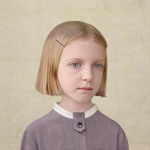
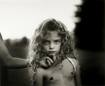
I looked through her work and saw these two images that i really liked as i thought they both presented meaning, one of worry and pain and the other of freedom and spontinuity.
I really enjoyed the talk because it gave me an insight into Wimbledon college of art which i am hopefully applying to go to myself.But moreover it was also interesting to hear about how she developed into her specialism and how the idea of planned performance art and spontaneous performance art can create very different outcomes, with more interactions with an audience or more reaction.

It was also interesting in how her work cross links between areas of art and how performance can be a method of art expression. I would like to do Costume for performance therefore i was very intrigued by how she believed her work was presented and how she developed her ideas and concepts.

Friday, 12 October 2012

Life Drawing

                                              3D Life Drawing Outcome


This weeks life drawing sesson focused around 3D observation, in which we worked on two pieces of work. We spent about 3 hours on this large clay head in which we focused on the facial features of the model and experimented with working onto and removing clay to create form and shape. This was succesful in some areas but obviously would have needed more work to correct all the wrong areas. For example, the mouth is slightly off centre and the nose needed to be worked at more to make it smaller.However, overall it does look like a roughly proportional female face.More than anything it shows how i have developed my life drawing observation skills and how i can work from both 2d and 3d forms.


We also focused on a full body clay model in which we focused mainly on the shaping of the body and the process of creating those forms. Overall this was a fairly succesful attempt, but more work did need to be done to it to make it more refined and more accurate. We spent about an hour on this piece.

Monday, 8 October 2012

Photography Review

                                                             Photography Review

Week Four:

During My week in photography, i was introduced to many things of interest to me, an example being the use of 35mm anaglogue cameras which we were taught to hand with sufficiency. We then developed the black and white images using negatives to create final outcomes.I really liked this aspect of the week because it was something i could have not taught myself and it was interesting learning about different styles of cameras as appose to just using a modern digital camera. It was also interesting to learn that you can create similar effects to what you can with a digitial, for example movement images (ghosting images).

The week was very pro-active which i like,We had to visit the town centre to take our own images using a compact camera which was also useful because by that point we had already used the film cameras so became much more conscious of the composition within the viewfinder as apposed to just snapping away to then delete them therefore it made me consider the image outcome more.

During the week we were also given photographers to research which i found very interesting as i fond myself drawn to specific contextual images and blakc and white photography. It was insightful to actually study an image instead of glancing at it and through doing that i gained more knowledge on how photographic composoition and context can be used.

Overall Photography was a very enjoyable week, in which i would like to continue to incorpurate into a choosen area.


Sunday, 7 October 2012

Lorna Simpson

                                                                    Lorna Simpson


This image is very strong due to its context.The use of typography to add to the image gives it a story which can help you further question the meaning behind the image. The use of water being thrown away is strong in that it creates links to the culture in many countries to have to walk miles for water, therefore the disregard to the water suggests a response to the typography. It also creates different tones in the image to make it more of an interesting composition. The use of this image with this typography was an interesting choice because it provokes thoughts on black history and how they may have always been disregarded, like the water.Overall i like the composition of this piece because it tells the audience a story rather than just presenting ideas. It also makes the image more interactive.

William Klein

                                            William Klein

This photograph interested me for several reasons.I liked that it has elements of fashion photography within it but that it is unique due to the backdrop of the image, which is often not the case as the foreground is often the focal point. The man in the background is mimicing a similar pose to that of the lady in the foreground which creates a contrast between the two figures, which also creates a gender contrast. It highlights the elegance of the female form and the slumped characteristic of the males. In some senses it is very stereotypical in how the different genders are percieved,however it is interesting to see that the mans clothing suggests that he is wealthy which contrasts the slumpled posture.Moreover i like the directional aspect of the photo which is creates by the staircase and the gazes of both the man and the women which makes the audiences eyes travel around the photogaph encouraging them to really look at all aspects of the image.

Friday, 5 October 2012

Thorsten Brinkmann

                                       Thorsten Brinkmann


This Photographer uses everyday items such as clothing,bags and lamp shades to transform a figure. His main interest is the transformation/process of his work: therefore we experimented ourselves in the photography studio to create a similar transformation pieces. i liked this because you could easily create a character with the chosen items.It is also an easy way to play with colour patterns and figure work therefore i could use this as an inspirational form of developing my work if i were to choose textiles or fashion. Below is an example that i did today during my photography induction week.I like how this has come out because it can be seen in different ways. It looks like both a beekeeper and a shepherd, purely from the colours of the fabrics that i choose and the props.It could be a really good way of creating obscure costumes.


Diane Arbus

                                              Diane Arbus


This image interests me because of how it challenges your expectations of the image.The use of twins has been done in a clever way to catch your eye but the context of the image draws you in further. I like that the two twins have been represented in different ways to question the stereotypical view of twins being identical. The emotion on the faces of the twin is an example of this. Moreover the hair of the left twin is much messier than that of the rights. Also, the arms of the left twin are shorter.This image is interesting in that it portrays the idea that twins can be very different. I like it because it allowed me to consider this idea: the image is playing on the use of young twins because it is often only young twins that are coupled together, once they get older they become seen as singular people therefore this image is strong in trying to create that idea from the outset.Moreover i like the central composition and the contrast filter on the image as appose to it being greyscale: it makes the twins the focal point and allows for the differences of the twins to be highlighted more.

Chesterfield Town


Here is a powerpoint video of some images i took during my photography induction, the location was chesterfield city centre on market day. Some of these images are based on juxtapositions, others colour.

Thursday, 4 October 2012

Lewis Hine

                                                                  Lewis Hine


I choose this image of Lewis Hine's because of its oberservational qualities.It is a simple yet very strong image which really portrays the circumstances of child labour/work in a historical context.There is no real clever/initative composition to ditract from the context which makes the photo all the more observational.I also like the expression of the children, because they have been captured in a very different way to that of Loretta Lux's in that they seem past adolescent,making the image all the more captivating as it makes you read the picture better as you instantly see it as a group of older boys/young men.I like the historical context of this image and the lack of planing behind the composition of the image as it makes it raw but very strong and captivating.

Henri Cartier Bresson

                                                      Henri Cartier Bresson


This photograph by Bresson is one of my favourite pieces. I like it because it has a thoughtprovoking technique which makes the audience consider a similar childhood memory,creating a small fuzz inside.However it is also interesting in that the background juxtaposes the overall happy/playful attitude of the image in that it is foggy and dissurted, suggesting an eary and unpleasant atmosphere,Therefore playing two emotions against eachother through the context of the image making it a very strong image. Moreover, i am interested in the image because it portrays a realistic historical context in which interests me as i also enjoy history.Ttherefore it allows me to consider different time periods for the piece and really gets me thinking about the circumstances behind the image.

Loretta Lux

                                                                      Loretta Lux


I like her use of children in a very sterotypical way. By this i mean that she creates an innocence and simplicity about the children, making them look unmoved and emotionless. However this works in a way to make the children seem robotic and almost disturbed which i think works really well to create a unique and strong representation of children. I really like this image because it shows exactly my thoughts behind loretta lux's work as a collection.Moreover the use of a neutral colour palette makes the childrens emotions and characteristics stronger instead of distract from them therefore highlights the 'odd' impression of the children.Overall i like loretta lux's work because it is unlike other child based art work and has been cleverly created to provoke the audience to further explore the image for hints about the expression of the children.

Monday, 1 October 2012

Shirin Neshat


                                       Shirin Neshat-Religious Photography


This photograph really interested me because of how unusual this image is.It is a very simple yet  has very cultural and religious messages behind the image.Because i have little knowledge on this culture it interests me  because of the stereotypically male dominated idea i have of an islamic community.Therefore this image really questioned many thoughts i had on islamic male/female roles, which is further emphasises with the use of light and dark.Moreover, the typography is islamic therefore it allows me to question what messages are visible on the image, as i cannot understand,alongside the symbolic use of a weapon.Personally, a succesful photograph allows the audiences opinions to be questioned and their thoughts to really question the meaning of the image, which this image definately does. Overall the composition further strengthens the image because it attracts an audience centrally, which works well,allowing a very crisp and strong ikmage to be created.


Sara Moon


                                     Sara Moon- Fashion Photographer


When researching sara moon i came across this image. I choose this image as one of my favourites due to its contrast of light and shadow alongside the contras of femininity and masculinity.The emphasis on the long neck creates a masculine characterstic of the model which draws attention to the detail f the clothing and creates a very editorial shot.Moreover the composition of the piece is both romance and deformity which work well together to create a breathtaking fashion shot.Overall i like this image because it is an original fashion editorial shot, which shows the early stages of questioning the stereotypical feminine body image.

Sally Mann


Photography-Sally Mann


This image of Sally Mann's was one of my favourite of her's because of how captivatity the image is and the message behind it. The use of adolescent girls to portray/ question a provocative female role is overwhelming and disturbing which is what makes her work so strong. She uses children to create a shocking image which others would be afarid to create. I also like the use of a hidden person to further question the meaning behind the image and the larger picture beyond the camera lens. Moreover this image works well being central because it gives the viewer a direct and central view of the young girl making it all the more shocking and stronger.